Power BI
If you’re new to Power BI from Microsoft, then chances are good that you’re going to encounter some issues with using the program exactly the way you want. Here are some problems you may encounter as you make your way through the program, including some solutions as to how you can potentially solve them.
Lack of Access to Reports While on the Go
Power BI has been often thought of as primarily a desktop application. In general, the reports that Power BI generated was being read in a thoroughly immobile situation like at your office or in a conference room. But if you need to view reports on the go for whatever reason, the service has recently updated to allow for mobile reading.
It’s available in the Windows 10 mobile app as well as the app for iPhone and reports are that it will shortly appear in the Android app as well. In the app, this is accessible from the menu icon with three lines in the top left corner next to where it says “My workspace,” for example. This involves opening the tile when you’re in focus mode and then hitting the option to open the report you want.
Trouble Forecasting Sales
Using modern computing technology such as Microsoft BI to predict and manage sales is one of the more popular ways to use it. You can do this in Power BI using something called Cortana Analytics. According to the site, this gives you 95% accuracy when it comes to reporting. Once you activate the prediction you gain access to a number of different visualizations such as predictions per person in terms of money earnings so you can see a comparison.
Trouble Comparing Groups in Graphic Detail
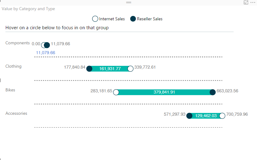
There are plenty of tools for doing a very basic comparison between two groups, but if you want a visualization that has a significant amount of specificity. One option is to use the gap analysis visualization that was recently announced from Microsoft. The tool specifically helps show how two groups are different when it comes to multiple different traits and categorizations. That way, you can see instantly whether one group performed better in one particular category over another group, how much better the first group did in terms of the gap in performance, and so on.
This also includes the ability to organizing the gaps however you want, such as showing which category gap between the two groups was the largest.
 Difficulty with Showing Shopping Behavior
Obviously, the crux of just about any business is going to be the shoppers or clients. In the case where shopping is done online or in another information-rich environment, it’s important to focus on the possibility of accurately depicting the behavior of the consumers of your products in visual form. After all, this is often useful for both intra-company external use. One option for doing this inside of Power BI is called the Sankey Bar Chart. The chart makes it easy to show important aspects of the process such as drop-off.
So, when you’re trying to figure out exactly where a major drop-off for your product is, this chart is useful. It works through a bar chart that quickly shows the difference between various stages of any process like your shopper’s user experience. Each of the bars will be connected since each of them represents a different part in the process. The connections between the bars will show what exactly is dropping off. That way, viewers can figure out what the problem is in their process and immediately put effort into correcting the issue. Creating value for viewers is the important thing in the process, after all.
Data integration Issues
If you’re having trouble figuring out how to easily get all of your data or the data of viewers into the program, one thing that you can now do as of approximately a year ago is combine Excel BI and Power BI Designer. Essentially, Excel is a program you can integrate with Power BI. If you have the 2013 version of the program, you can use Excel Workbooks to publish whatever you want right into Power BI. This also lets you share any analysis, data, or other types of visualizations with other people also using Power BI.
If it so happens that you don’t’ have a version of Excel such as Excel 2013, this doesn’t mean that you’re completely out of luck, however. You can instead use a similar reporter-creating tool inside of the software. It’s possible to import data from other sources this way directly and then model it and publish it straight to the service that Power BI provides.
Lack of Universal Data Access
Power BI now has the ability to allow you to access cloud services directly from it. So, if you previously had difficulty with importing and streaming data due to using a different program or a version of Power BI that didn’t work well with this, you will be able to use these new capabilities
Falling Behind Competitors Due to Time Lapse
Many options for metrics often have a lapse between when you first activate them and when they portray the metric. This is one of the advantages of Power BI, specifically that you can portray everything in real-time on your dashboard. It means that you can fix any issues that come up in your business exactly as they occur without a delay.
For more information on Power BI and related topics, please contact us today.


